Brief: General Assembly Project, “Design a product for REI that provides useful information to climbers. For the first iteration, focus solely on Colorado climbing.”
Duration: 2 - Week Agile Sprint
Platforms: Desktop and Mobile Responsive Website
Team: Jonathan, Caren, Olga
Desktop Prototype Flow 1: https://tinyurl.com/rack-and-rappel
Desktop Prototype Flow 2: https://tinyurl.com/rack-and-rappel-2
Mobile Prototype: https://tinyurl.com/rack-and-rappel-mobile
Role: Content Strategist, Researcher, Designer (Team of Four)
Methods: Competitive/Comparative Analysis, Interviews, Affinity Mapping, Feature Prioritization Chart, Business Model Canvas, Persona, Storyboarding, Wireframe Sketching, Wire-flows, Information Architecture, Writing, User Testing, Data Analysis, Low-Fi / Mid-Fi / Hi-Fidelity Prototyping
Tools: Pen & Paper / Asana / Zoom / Google Workspace / Otter / Maze / Optimal Workshop / FigJam & Figma


Overview
Rack & Rappel - An REI Climbers’ Platform Concept Design
Significance
The climbing market has a lot of potential e-commerce revenue
The American Alpine Club’s “State of Climbing, 2019” reported an estimated 300,000 - 500,000 active climbers in the US, with a combined $170 million spent on climbing gear, and a 50% growth within the climbing community in ten years.
Findings, from 18 climbers that I surveyed through Optimal Workshop, reveal that REI still has the potential to reach many more online customers; with annual spending averaging about $550 per climber.

Discovery & Research
Competitive/Comparative Analysis
Affinity Mapping
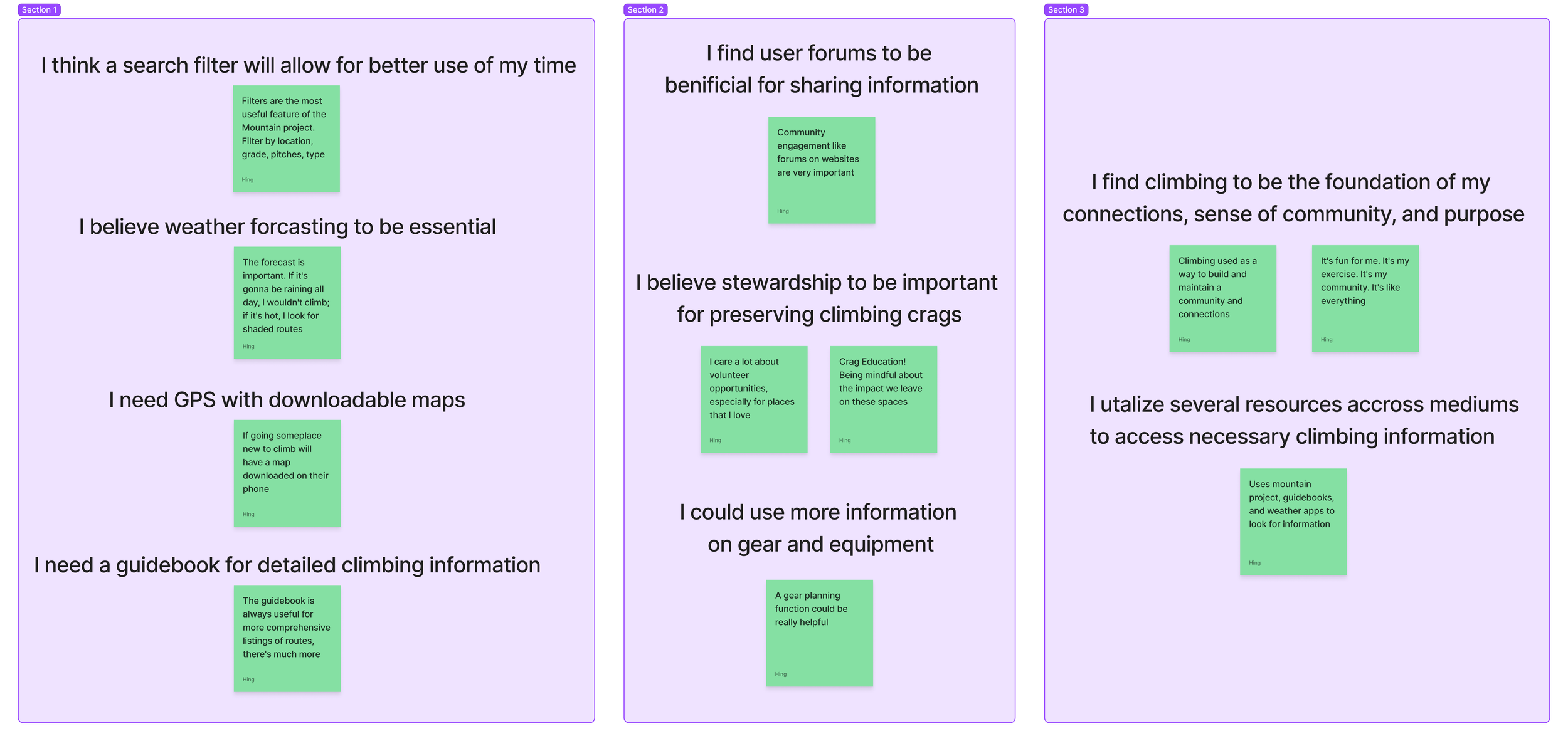
I conducted five interviews with experienced, lifelong American climbers.
Participants ages 26 to 48, male and female, with white and blue-collared professions, and a mix of ethnic and national backgrounds.
Questions were asked to gain insight on valued features, resources, and habits around accessing climbing information.
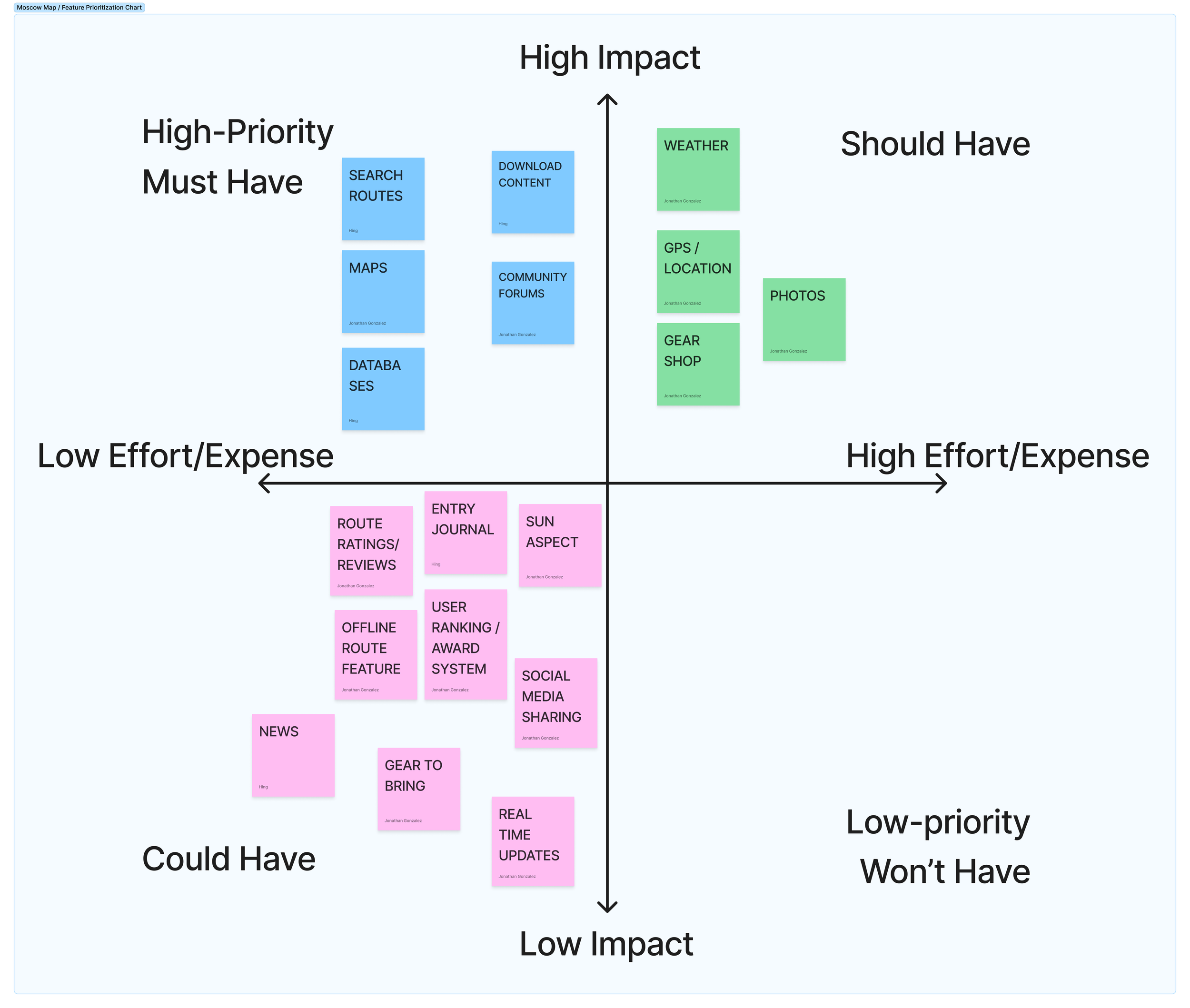
Moscow Map / Feature Prioritization
As a team, we assessed featured inventory against four direct competitors, Mountain Project, The Crag, UK Climbing, and SuperTopo; along with two comparators, All Trails and Facebook. We gained specific insights to the broad scope and depth of information that the platforms offer.
Then by utilizing a Moscow map, we determine common and unique competitor/comparator features that would be prioritized in our design.
Bonus Features
Essential Features
Importance / Needs



User Persona
Interviews
From user interview insights, I was able to help ideate a user persona. Commonalities from responses shaped the creation of Jake. Such as, Jake wanting a single place where he could view all things climbing:
Climbing Information
Weather Updates and Maps
A General Scope of the Local Climbing Community
A Method to Search through Climbs that Appeal to him and his wife
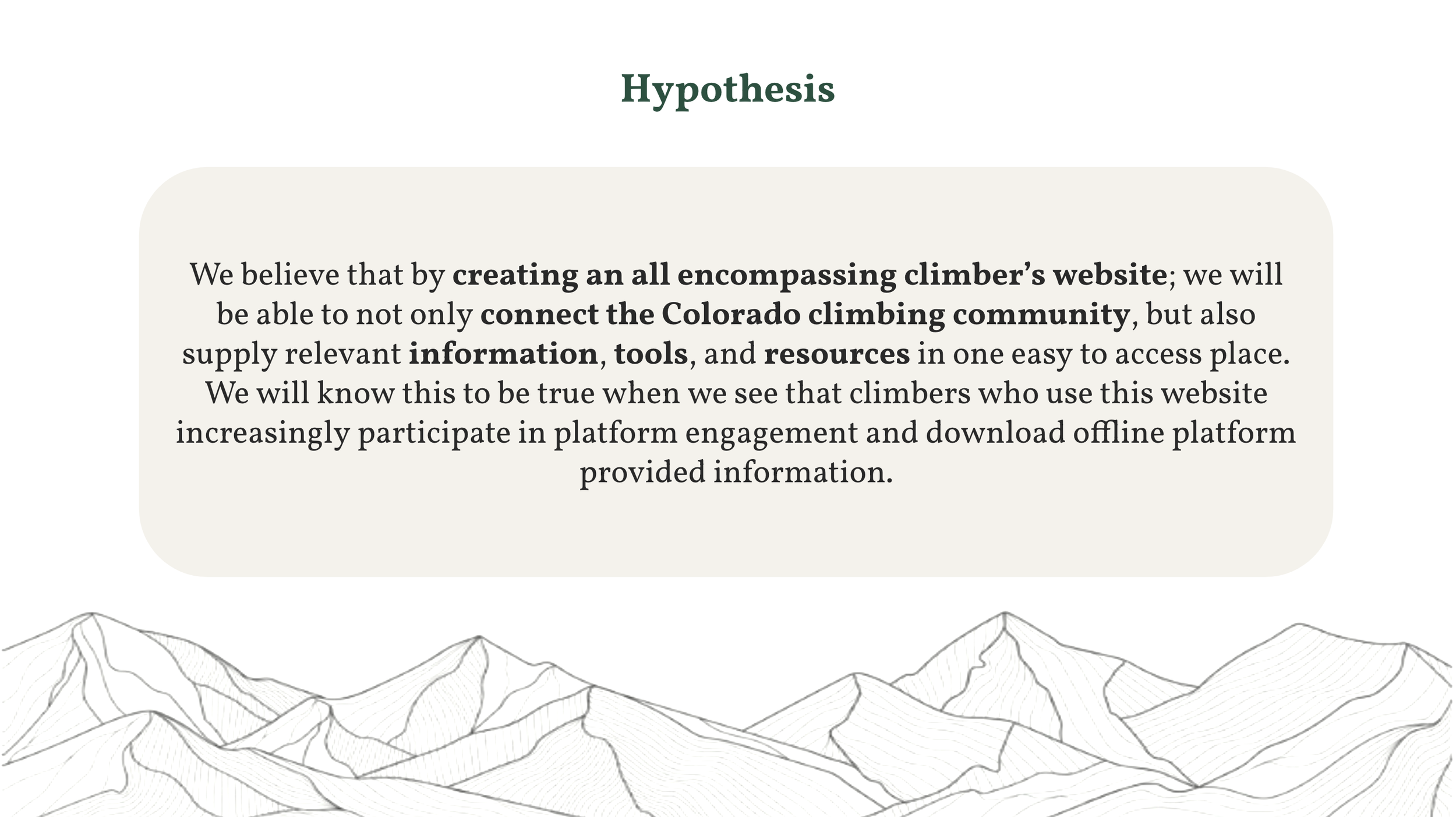
By understanding Jake’s needs and frustration, I helped formulate our team’s problem statement and hypothesis.
The main issue is that there are too many platforms and mediums of information that are required to thoroughly plan a climbing trip.
The team created a storyboard to represent Jake’s common problem.
To help Jake and the climbing community as a whole, we wanted to create an all-encompassing climber’s website

Problem Statment
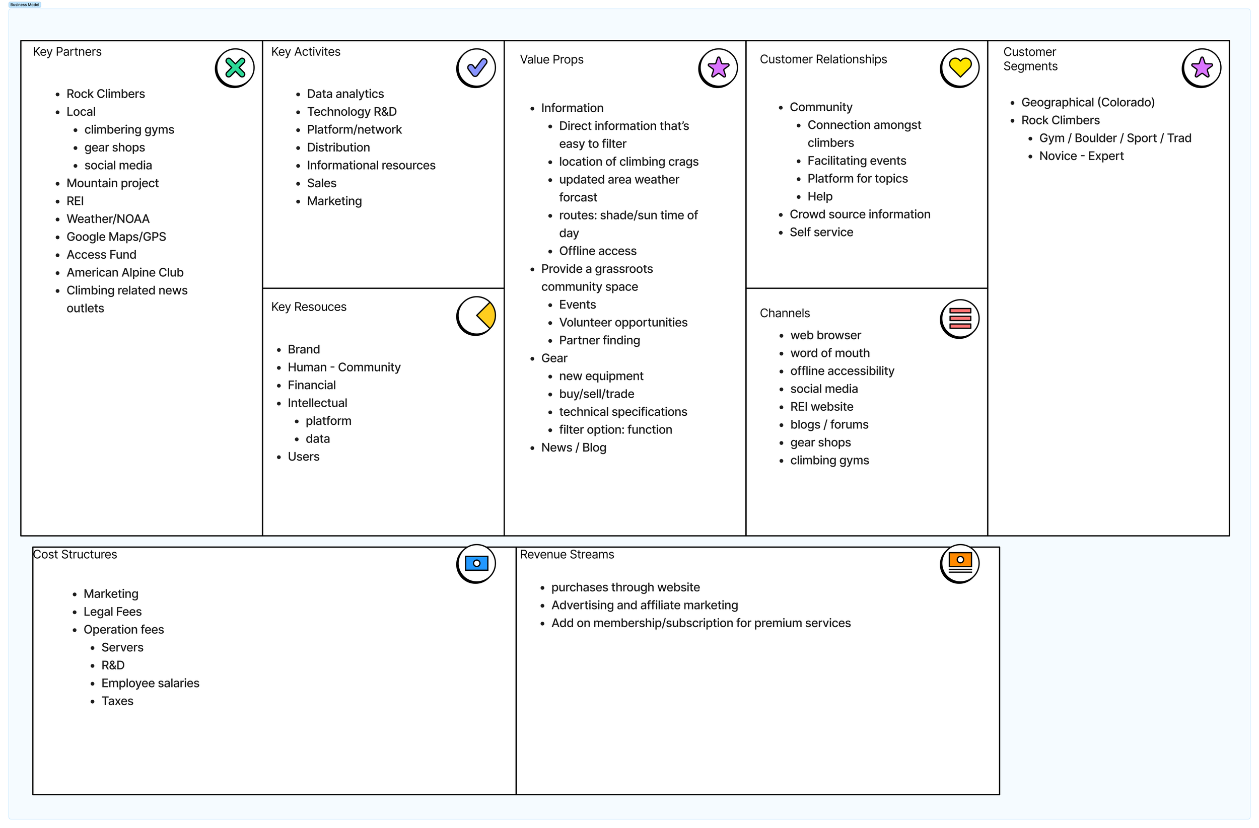
We formulated a business model for our product to ensure monetary value for REI, feasibility, logistics, and value for users.
Business Model
Sketching & Ideation
Information Architecture
User Flow & Sketch Ideation
Community Page
Branding
Database
Search for routes
Download content
Maps
Weather
Personal
Favorite routes
Entry journal
Community
Community forums
Ratings/reviews
Ranking / Award System
Social media sharing
Photos
Other
News
REI gear shopping suggestions
Real-time updates
Gear to bring
Offline route feature
GPS + location
Sun aspect
Tools
Together, we created the Information Architecture based on our Feature Prioritization


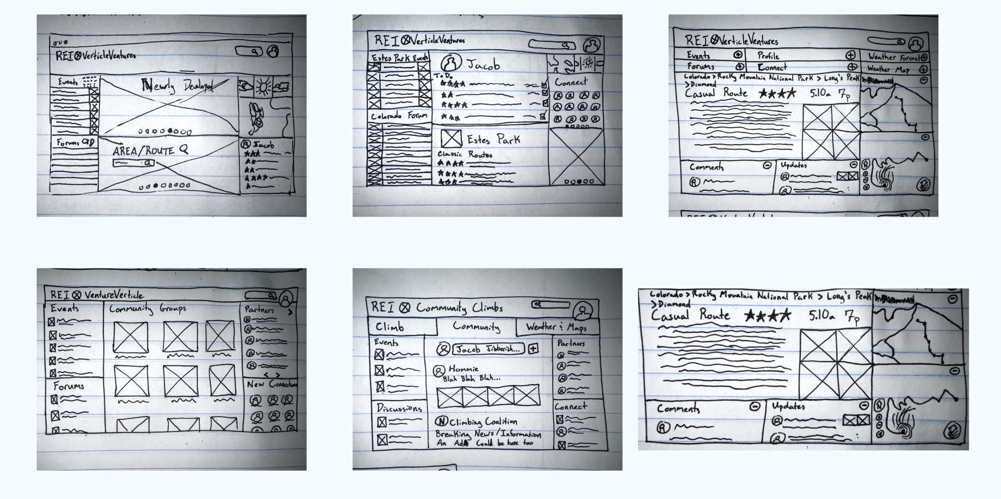
Individually, we drafted user flows and sketched wireframes.
We followed our user scenario of Jake searching for a climbing route in Estes Park, Colorado.
We referenced our information architecture to design a research based product.

Information Architecture
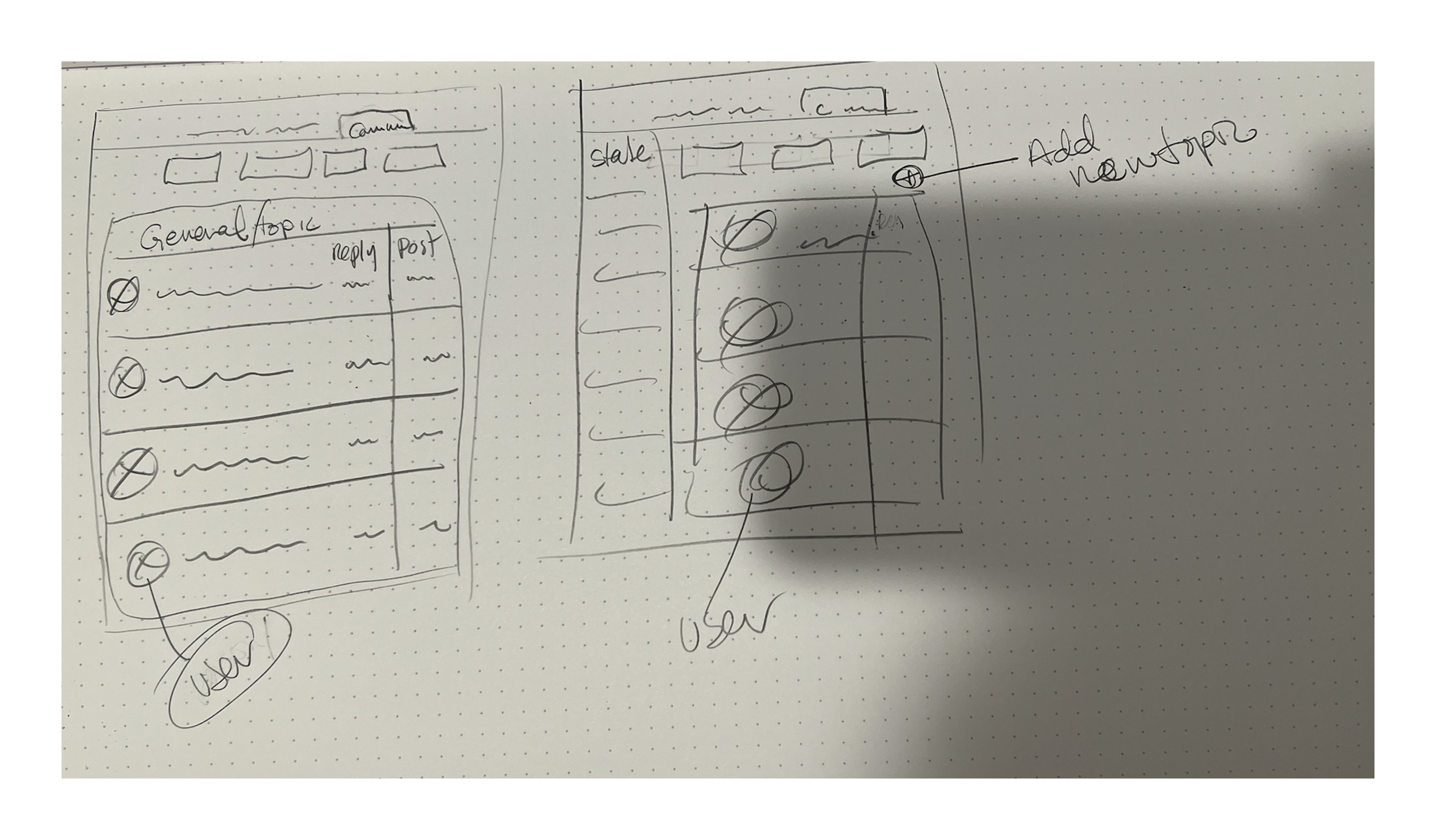
I formulated the IA for the community page and personal profile
Wireframe
Through Design Studio drafted and selected the best design

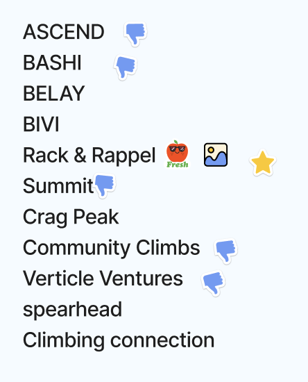
Name
Climbing related brainstorm & vote
Logo
A logo to compliment REI’s was selected
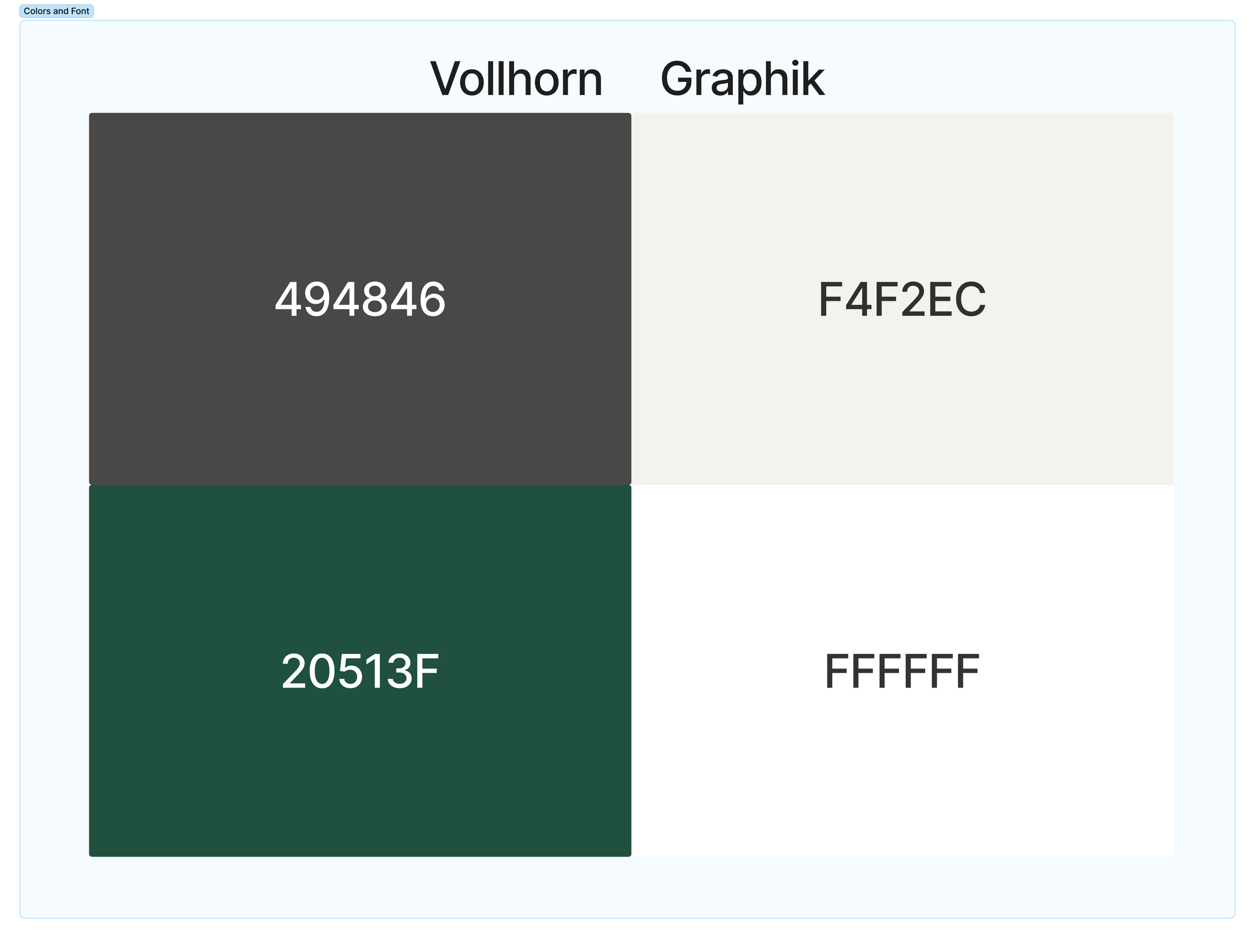
Colors & Fonts
Earth-tones & REI themed fonts were chosen
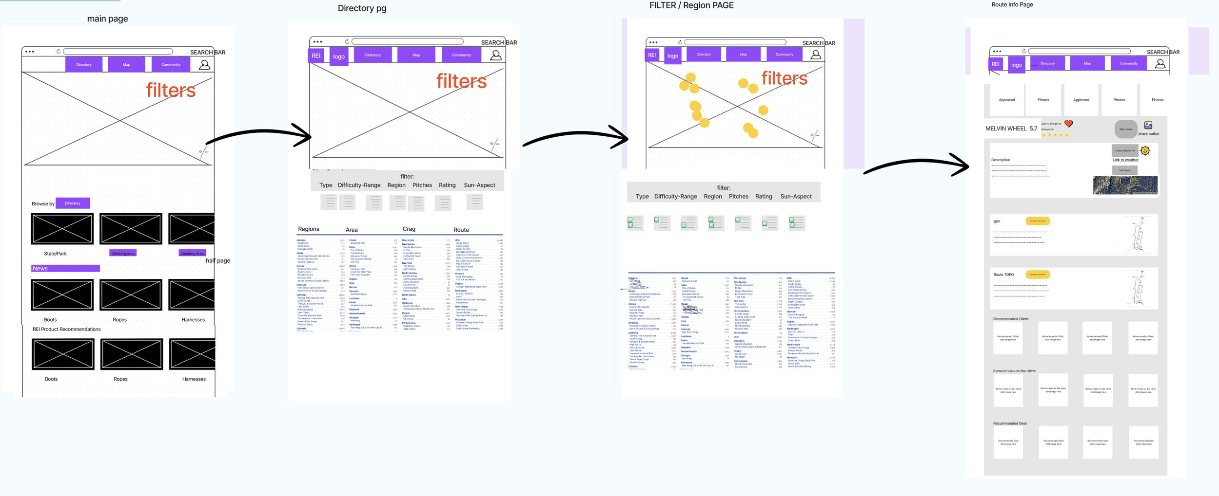
Narrowing Scope & Structure
Wireframes
Through FigJam, as a team, we drafted wireframe designs that implemented the best layouts from each of our sketches.
A Lowfidelity Prototype was then created in Figma.
Prototyping & Testing
Mobile Responsive
Desktop Website
Like our Mobile Site, the Desktop Site had improvements with the search filter, CTAs were added,
better UX writing was implemented, accessibility and visibility of buttons were strengthened
Prototypes were designed in Figma, reiterated upon, and refined based on user testing in Maze and user feedback.
I tried to recruit climbers for testing in order to reflect our intended users.
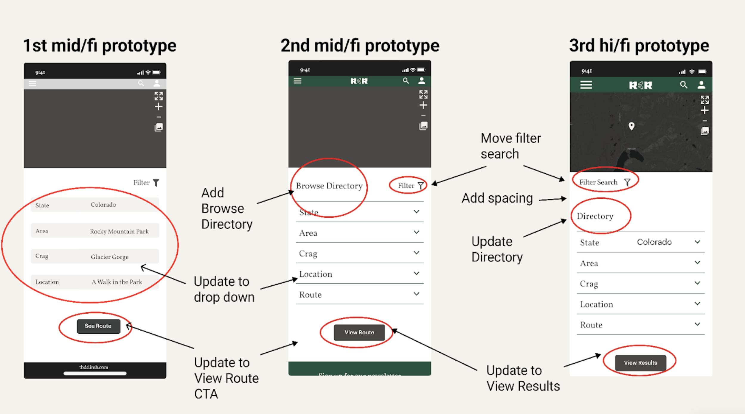
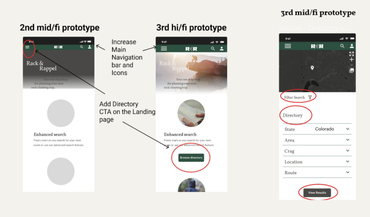
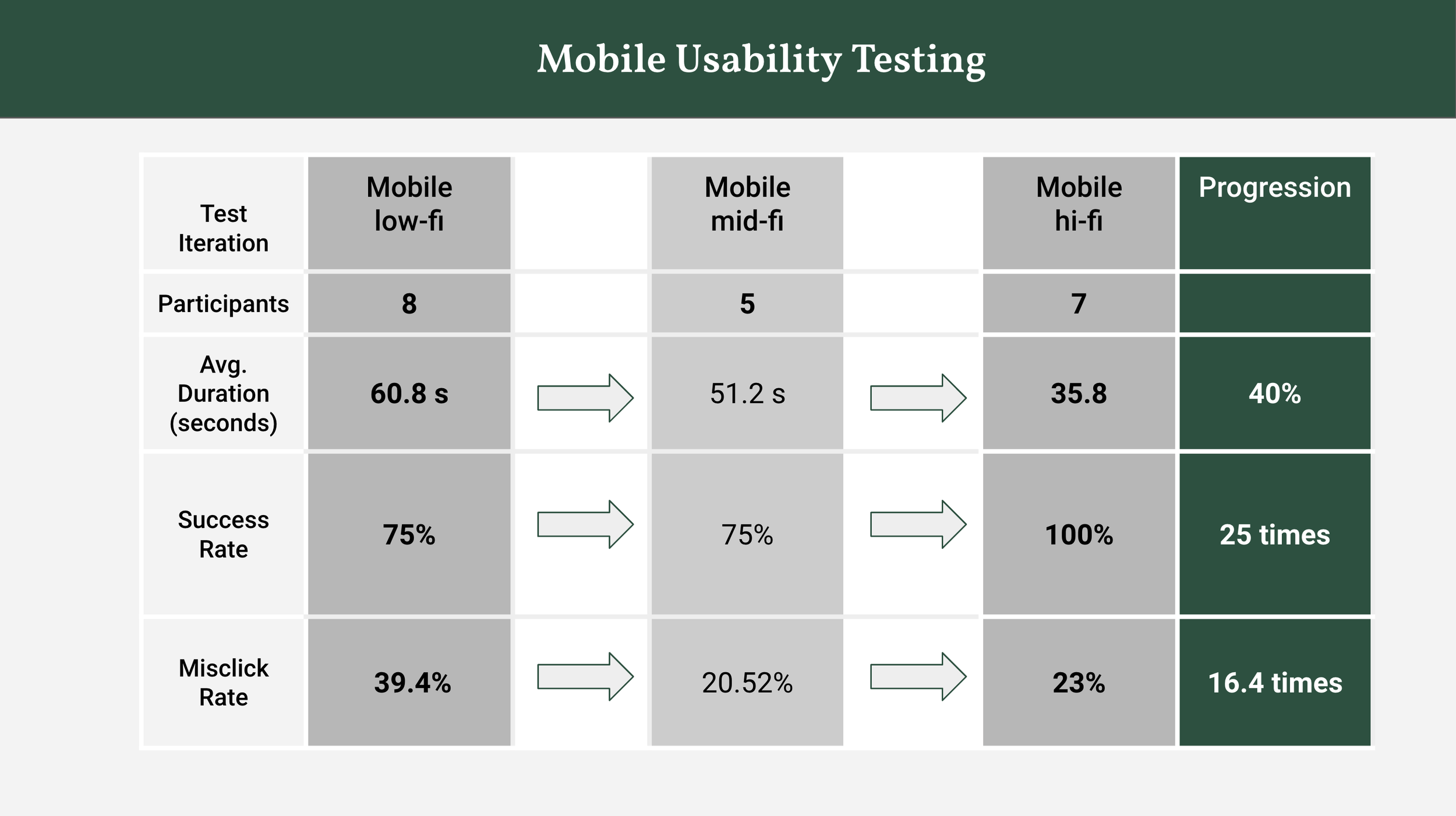

With each round of Mid-Fi testing and feedback, we made changes to improve usability — such as on the Directory Page.
We asked users to find the Rocky Mountain Region within the Directory to arrive at the Spearhead Route.
Here we uncovered that the affordances such as the filter icon were not visible, and the “Browse Directory” and “View Route” buttons were not clear — resulting in a mere 62% success rate.
But, by updating the signifiers on the directory page, adding a drop-down menu to reduce scrolling fatigue, and providing clearer wording on the Call to Action Button — we were able to streamline success.
From our Mid/Fi to Hi/Fi Prototype we added a CTA and increased Icon Sizes for better Accessibility.
The “Browse Directory” CTA that was added to the Landing Page instantly had a 72% success rate; clearly proving to be an Effective Pathway, which had more Visible Interaction over the Hamburger Icon with a 28% success rate.
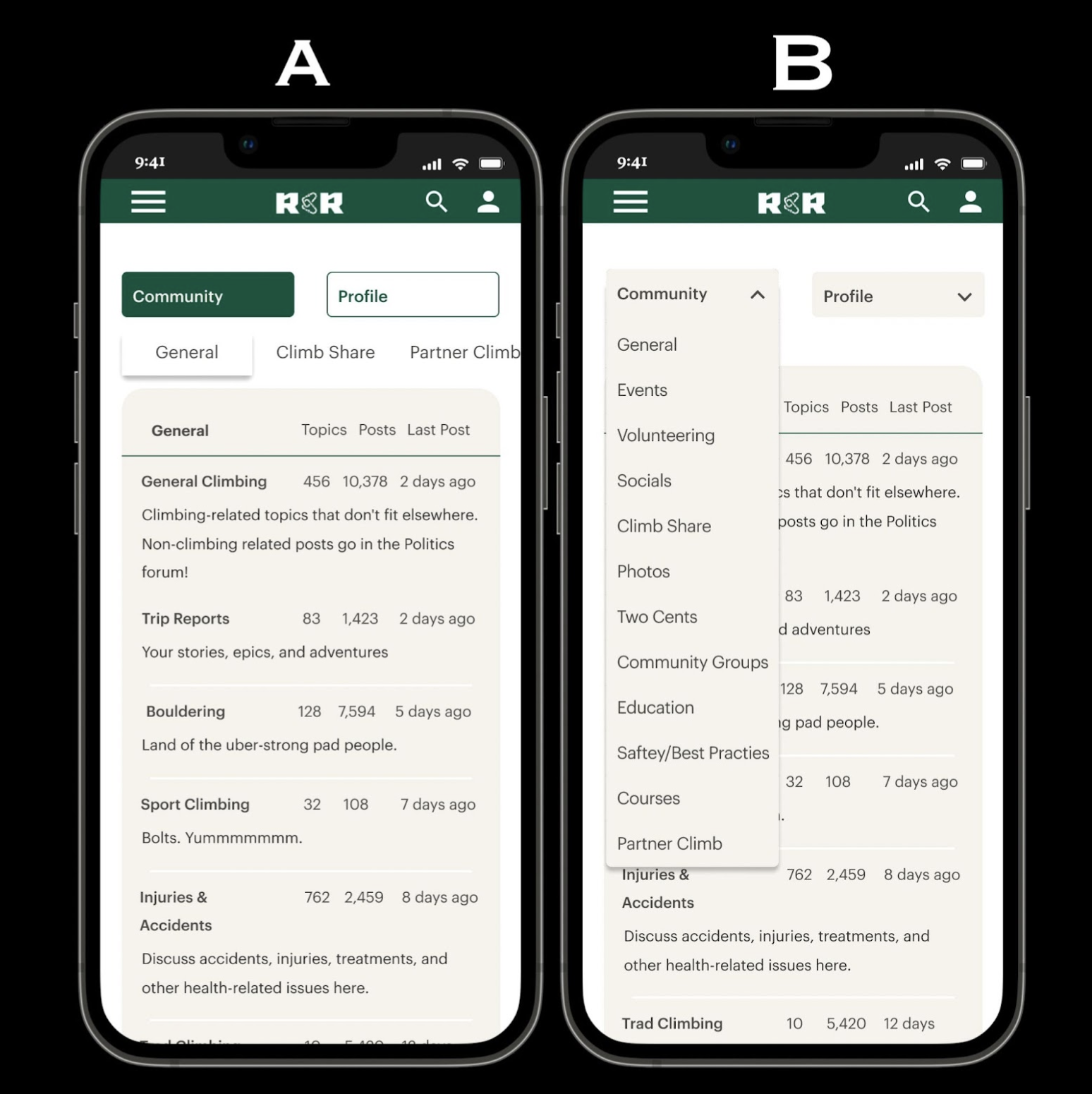
Additionally, according to some testers, the Community Page Navigation was confusing.
Interaction Designs were improved upon by using A/B testing to determine a preferred navigational layout.
With user results leading us to select A with 8/10 votes - we went with horizontal scrolling, as a form of comfortable Constraints
Summary


Next Steps
Improve User Interface and User Experience Design
Expand on features that set us apart from Direct Competitor, Mountain Project; ie. route topo
Improve Search Filter Interaction Design
Improve Site Layout, User Flow, Navigation; ie. community & profile pages
Create Site Map
User Testing & Research on Information Architecture
Further build-out features; ie. REI e-commerce
Explore how to gain users from existing platforms; ie. Mountain Project and Facebook
Explore how to integrate systems; ie. route database, NOAA, GPS, community organizations, partner finder
Learnings
Our scope was extremely broad and covered too many features to make an exceptionally designed product
There is minimal value of our product design considering Mountain Project has nearly all of the same features and has existing users
Having a background in the industry, I could have helped further steer design toward a more unique product
The Research base could have been broader, beyond highly experienced alpine trad climbers
Being a climber, I should have tried to separate my emotions further from the product design process and made more objective, researched based decisions
Roles should have been assigned and specific from the beginning of the sprint to avoid conflict, improve individual contribution, and increase efficiency